Saturday 5 May 2012
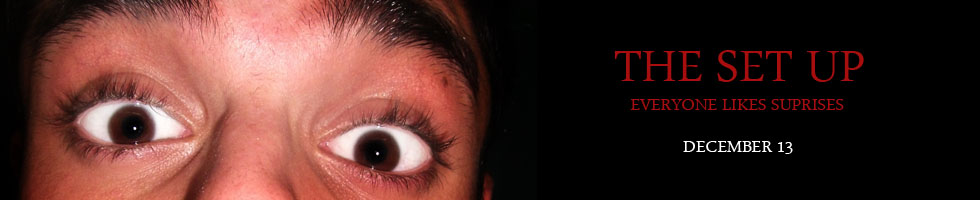
The Set Up Final Draft
Untitled from Sian Williams on Vimeo.
This is the final draft of our film; even though it's improved quite a bit from our first draft, I feel there are still many things I'd like to change/improve on in order to make it more effective. Something which I'm really pleased with is the effect of the intruder, which we created by using a handheld camera in order to intrigue the audience and build an intense atmosphere. The handheld camera was great in the way that it gave the shots a shaky effect and cautious edge, as if the intruder was trying to keep their presence unknown.
Another improvement is the sound- we decided to cut the sound from the beginning and instead start the crescendo when the intruder enters the house; this provokes the audience into feeling uneasy and is much more effective. Also, in the first draft a backing track was used throughout most of the piece to create an eerie atmosphere- by changing this and cutting the amount of sound down, the sound that is there is much more effective. Overall, the sound is much more subtler in moments of tension as before it distracted from the realness of the piece.
In my opinion, I don't think the storyline is as clear as we'd like- this makes the twist at the end much less shocking as it still leaves some questions unanswered. For example, the intruder grabbing the knife was in fact to cut the cake, and we intended to show this by having someone cutting the cake and zooming in to finish. However, with the way the party scene was set up, it was quite hard to achieve this and we missed it out. For the future though, I'd plan the signs and codes more efficiently in order to make sure they came across as we intended.
Something else I'd change is the ending- when the protagonist is grabbed there should have been more tension built before the surprise party is revealed. We could've achieved this by having a long blackout with just audio (maybe heavy breathing) or some sort of struggle scene- by building this up, the twist would've been a huge shock and the audience would've felt relieved.
Overall, we are quite pleased seeing as this is the first film we've ever had to script/plan/produce. The experience was completely different to anything I have ever done as there are so many things to consider and research. I really enjoyed creating this film and has given us so many ideas for the future as you are always thinking of ways to improve the final product. I have accepted that our film won't be exactly what we'd imagined due to our budget and experience- but it has given us a greater knowledge of what is required to take an idea and actually produce it.
According to Stuart Hall's theory of positioning, I think our audience would've gained a negotiated meaning of our film as some of the signs and codes aren't completely clear; however, this is all part of the process and allows us to improve in the future.
Friday 4 May 2012
European Film Festival
On the 30th March, my media group and I went to Paris to attend the European film festival. The festival consisted of 2 days where a variety of film makers from all over Europe showed films that they had made. There were many short films covering different genres including horror, documentaries and animation which allowed us to view many different styles and methods in order to portray an idea. This festival was extremely interesting as it gave me many ideas of how I could improve my film and different directions I could've taken it- it also gave me inspiration for future products I may produce.
An interesting factor of the festival was that most of the directors and even actors featured in the film attended the festival, giving us the opportunity to ask them questions and converse with them after the viewing.
Monday 16 April 2012

Friday 9 December 2011
Radio Trailer
Trailer by sianlouisee
This is the radio trailer for our short film 'The Set Up'. After researching horror trailers and their audio, we decided to use our knowledge to create a thirty second trailer to promote our film. We are pleased with the end result of our trailer as we feel it portrays the genre and plot effectively. The character's dialogue used gives the audience an insight as to what the plot is about, however, it doesn't spoil the story line, which leaves the audience curious and wanting to see the film.
This is the radio trailer for our short film 'The Set Up'. After researching horror trailers and their audio, we decided to use our knowledge to create a thirty second trailer to promote our film. We are pleased with the end result of our trailer as we feel it portrays the genre and plot effectively. The character's dialogue used gives the audience an insight as to what the plot is about, however, it doesn't spoil the story line, which leaves the audience curious and wanting to see the film.
Tuesday 6 December 2011
Monday 28 November 2011

Saturday 19 November 2011
'The Set Up' - Final poster at work

This is our film poster on a local bus stop- it could also be displayed in many other places such as outside cinemas, billboards, inside buildings and more. The point of this is to advertise the film and make people interested in seeing it; by advertising in public places, we are exposing the film to our target audience which is people over the age of 12.
It would be very unlikely to see this scale of advertising for a short film mainly due to the financial aspect, and therefore a short film would probably opt for handing out flyers and using social networking to spread awareness.
Thursday 17 November 2011
Final Poster

After looking at our last poster and asking the opinion of our peers, we decided to change the look of our poster, making it stand out from other posters and slightly challenging common conventions. Something which our peers suggested was to portray the mysterious atmosphere in the film by adding a misty effect round the edge of our poster. I think this rather effective and is more in-keeping with our genre, which is psychological thriller. Compared to our last poster, I feel that this one is much more reflective of the plot and the mysterious tone entices the audience, leaving them wanting to know more.
Tuesday 15 November 2011
Research and planning grade: 16/20
 To improve your mark:
- Re-write the pitch feedback - too similar to Hannah's
- Upload pitch
- Upload sample scene
- Reflect on essays
- Upload any mind maps/notes/facebook planning etc and annotate
Monday 14 November 2011
The Set Up Poster

Here is the advertisement poster we created using Photoshop to advertise our short film. We used conventions from other horror posters to show that the film is of the horror genre. These conventions include: black background with bold red text, mysterious image relating to the plot, a catchy slogan to portray that the film is a horror.
The image displays the end of one of the final scenes whereby the protagonist is grabbed from behind by a gloved mystery figure unaware that he will shortly be presented with a suprise party. These original sketch of the poster displayed a medium shot and an outline of the mystery figure. We felt that this close up shot would build more suspicion as to the events of the film and the close up on his face allows us to see the fear in his eyes and his general facial expression. This ideal poster has been created combining some of our original sketch elements this with real horror posters i have researched of accredited films from the last five years (recent).
Saturday 12 November 2011
Friday 11 November 2011
First draft of 'The Set Up' poster
The Set-Up (First Draft of Film Poster)
View more documents from digalogabob1
The first draft of our film poster experiments with colour and we have decided to use black, red and white for our colour scheme. These colours are commonly used in horror posters as black and red contrast well and compliment the white whilst standing out and looking bold. Red symbolises blood and danger, accentuating the idea of a horror plot.
We have hinted about the idea of the suprise party, without giving too much away; 'everyone likes suprises' can be interpreted in many ways and suggests that the protagonist will encounter something negative when it is in fact the opposite.
Thursday 10 November 2011
Poster Sketch
 \
\This is my first plan and sketch of the advertisement poster for our short film 'The Set Up'. We would like to use a close-up of the protagonist looking scared and panicked in order to mislead the audience and accentuate the idea that the film is a horror. By convincing the audience that the film is a horror, firstly by making the poster look realistic and including conventions associated with horror films, we will achieve in making the audience feel shocked at the end of our film where the plot is twisted and the atmosphere changes. We are looking to use red, black and white as our colour scheme as these colours compliment each other and look effective; red signifies danger and violence therefore presenting the idea that this is what the plot will include.
Wednesday 9 November 2011
Poster Analysis Evaluation
After looking at numerous horror posters and analysing the poster for 'Prom Night' and 'The Last House on the Left', I have noticed a number of similar conventions used to portray the horror genre:
- The colour red used against a dark background looks effective and stands out- red signifies danger and hints that the plot will include this
- An image that hints at the plot but does not give too much away- this lets the audience use their imagination and want to know more, ending in them wanting to watch the film
- A catchy slogan- this often hints at the plot and misleads or interests the audience. The 'Prom Night' poster uses a clever twist on words 'a night to die for', which has a double meaning in this case.
- A release date to give the audience information on when they can see the film.
Tuesday 8 November 2011
The Set Up- First Draft
Untitled from Sian Williams on Vimeo.
This is the first draft of our short film 'The Set Up'. After watching the draft, we realised there are a number of things we needed to change in order to make the film more effective:
- The sound is too full on- we are going to edit the music so it builds up more slowly. At the moment, it is very intense straight away and doesn't give the audience a chance to fall into the story. By using a much slower crescendo, the audience will be lulled into a false sense of security.
- The idea of an 'intruder' needs to be more obvious- we use the 'unknown phone' and knife to create the idea of an unknown person in the house, however, we have discussed that by using a point of view shot of the intruder coming into the house while the protagonist is upstairs increases tension and will be much more interesting.
- The bathroom scene- was actually filmed during the day, and this is obvious. The scene needs to be re-filmed at night to ensure the continuity of the film is believable.
- Cuts between shots- need to be smoother in some parts as not to distract from the reality of the film.
With these changes we think the film we be much more effective and engaging, as at the moment tension is somewhat ruined by the sound and disjointed cuts.
Monday 7 November 2011
Film Schedule
The Filming Process LOG.
View more documents from digalogabob1
This log shows how we want about filming our scenes and planning in advance to make sure the team was available.
This log shows how we want about filming our scenes and planning in advance to make sure the team was available.
Sunday 6 November 2011
Pitch Evaluation
Our pitch for 'The Set Up' went really well; the class enjoyed our sample scene and even said they would fund our idea if they were a real company in the industry. We received lots of positive feedback, as well as some comments that will allow us to improve on our ideas; one of these being about the lighting (it was too dark)- something that we already knew we had to improve on. Our classmates suggested using more lights such as lamps or torches, or reflectors to manage the light in the scene whilst maintaining the eerie, night-time feel.
We were praised on our use of codes and conventions, as the class felt they portrayed the conventions of the horror genre really well. This was a great confidence boost for me and my partner as we had spent a lot of time researching this element of our film- it is especially important to have effective codes as that is what will make the twist at the end all the more shocking.
One of our classmates challenged our use of a male character for the protagonist, as this does not fit usual horror conventions, however, we decided that a male being made to look vulnerable would increase tension and build on the intense atmosphere. Of course, we must remember that it is not actually a horror, but a psychological thriller with a twist.
Overall, the feedback we received helped us greatly and will allow to make our film much more effective. We have taken away all suggestions and are currently discussing how we can interpret them into our film.
Saturday 5 November 2011
Treatment
View more documents from sianylou.
This treatment has a full breakdown of our plot and characters in terms of important conventions that we've considered. It also contains our script, initial ideas and funding. This document was given to our peers in our pitch as we read out key points and allowed them to read about our idea in more detail.
This treatment has a full breakdown of our plot and characters in terms of important conventions that we've considered. It also contains our script, initial ideas and funding. This document was given to our peers in our pitch as we read out key points and allowed them to read about our idea in more detail.
Storyboard Presentation
This is the presentation showed to our peers in our pitch; it explains where our plot will lead and shows the key moments of action which make up the story line. This presentation consists of our 10 shot analysis but in a bit more detail.
Friday 4 November 2011
Storyboard
This 10 shot breakdown of our film will give us a structure to refer to in the future if we lose sight of the direction of our film. Even though the plan is quite vague, it lists the key moments of action which are important to our plot- this still gives us room to change small elements of our story if we feel it is necessary but reminds us where the changes need to lead.
Friday 14 October 2011
Analysing a shot from 'About A Girl'

Analysing this shot from 'About a Girl' gave me and my partner some ideas about how to portray the genre throughout the film using subtler techniques. We learnt that even the background and position of the character can reflect the genre and make the film look extremely effective. When planning our film at a more detailed level, we will try to include some subtle props that will accentuate the genre and make our film look effective and realistic.
Friday 7 October 2011
Looking at short films: 'Lovefield'
As you can see I have analyzed the short film 'Lovefield' by Mathieu Ratthe in terms of media language and genre. We found this extremely inspiring as it introduced the idea of a twist to shock the audience- something that we hadn't considered. I really liked that throughout the film we experienced a range of emotions as we were fooled into believing the film was a horror. The fantastic use of signs and codes which we would usually relate to horror because of stereotypes such as blood and knives etc, in fact created a completely different meaning.
The intensity of the twist is something that we want to create in our own film.
Tuesday 4 October 2011
Gaining Inspiration
To get some ideas for our short film, we have decided to look at a few short films in order to gain inspiration as to what genre we could use. Many of the short films appear to be of the horror genre, which is something we are interested in pursuing. We have already looked at 'Smashed' and 'The Insane'; I really didn't enjoy 'The Insane' as I don't enjoy gory films and found it uncomfortable to watch.
Studying a short film 'Smashed'
In order to get some inspiration for our film and think more deeply about how to represent certain ideas, we were set the task to analyze the short film 'Smashed'. We were told to look at how camera, edit, mise-en-scene and sound were used to portray significant elements. Looking in detail at how signs and codes were used to provoke the audience into responding in a certain way, made me realize how important the small details can be when it comes to producing an effective final product.
Subscribe to:
Posts (Atom)